Museums are unique physical spaces in such that they provide the genuine experience of being in presence of art. A thing Digital products cannot equal yet, but they still extend the way you explore and learn about art objects.
A museum
in the digital age
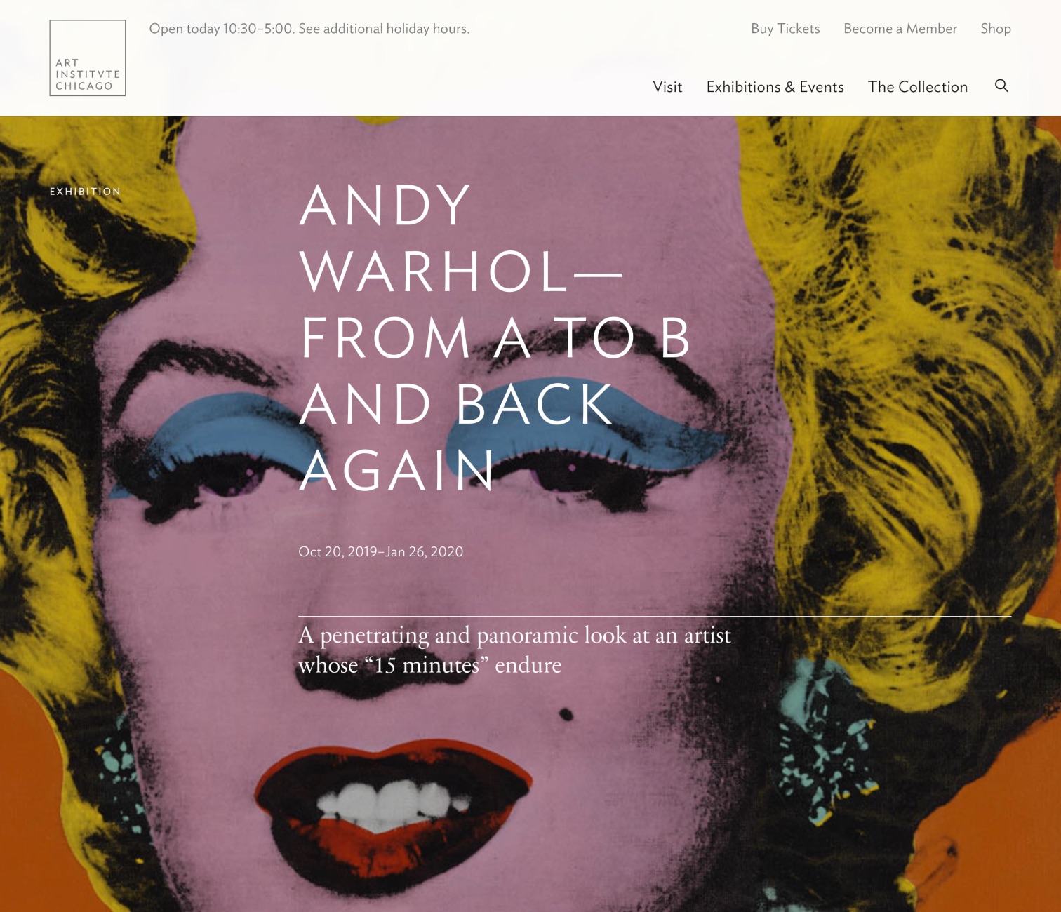
- Role
- UX Design Director at AREA 17
- Activities
- Research, Discovery, UX Strategy and Interaction Design.
Artworks as landing pages
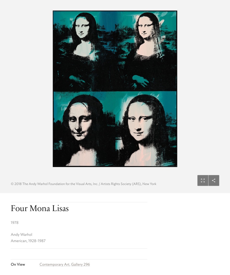
A major insight from the analytics is that most of the incoming traffic is going directly to artwork pages. We naturally put the emphasis on having hi-res visuals front and center for the user to explore the most finest details through intuitive image interactions, and a progressive disclosure of advanced tools and research oriented information.
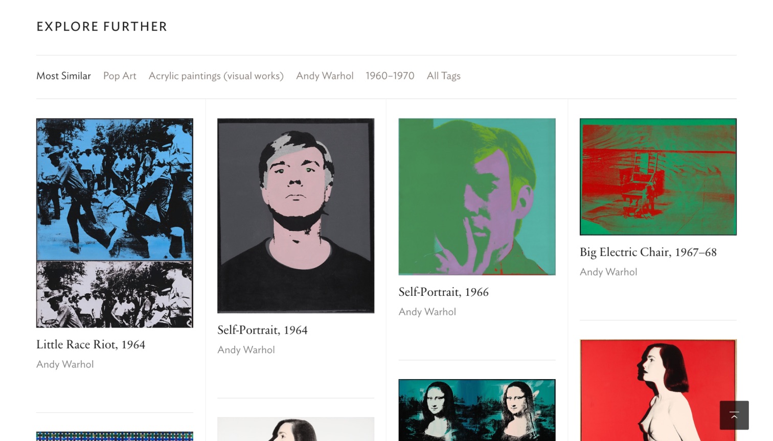
As a starting point in the experience, artwork pages should be everything but dead-ends. We completed the content with the most relevant artworks users might be interested in, providing ways to explore the collection from the current artwork context.
Cultural knowledge
The overarching design concept was to see the Art Institute of Chicago as an opportunity for visitors to extend their cultural knowledge, to promote features and interactions that fosters exploration of the collection from the art movements perspective. Beyond the integration of a classic faceted search filter mechanism, i explored how to surface popular styles to suggest point of views of the collection, a simple and subtle way to discover art pieces and understand how art categories relates to each other.
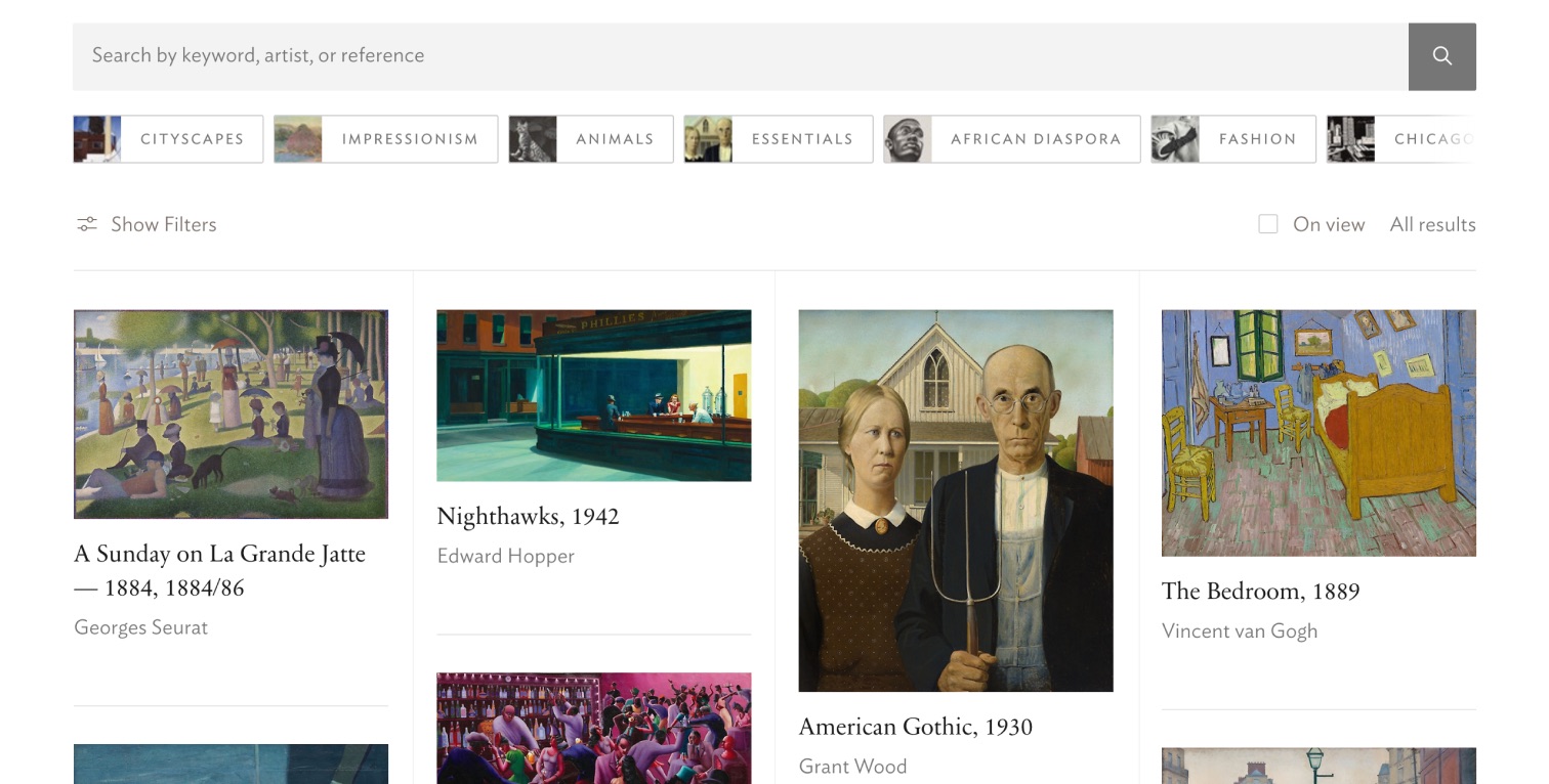
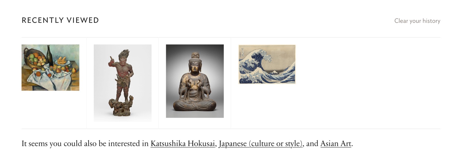
With the introduction of a “Recently viewed” module, we can automatically suggests art movements based on recent browsing history, an effortless way for the visitor to discover different art categories.
Functional simplicity
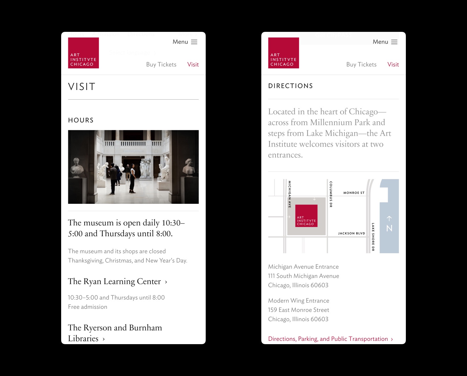
Beyond inspiration, the first and practical goal is to help users plan their visit and buy tickets. Our objective was to find the right balance between high-level information that covers most of the use cases and advanced documentation for academics and researchers. By relying on a single page that provides everything needed to prepare a visit, we also designed a solution that fits perfectly with mobile viewports.
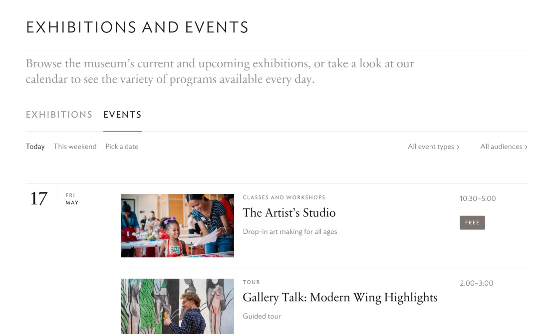
Exhibition and events are surfaced through a filtering system that matches visitor motivations to find what to do “This weekend” for example.
Design process
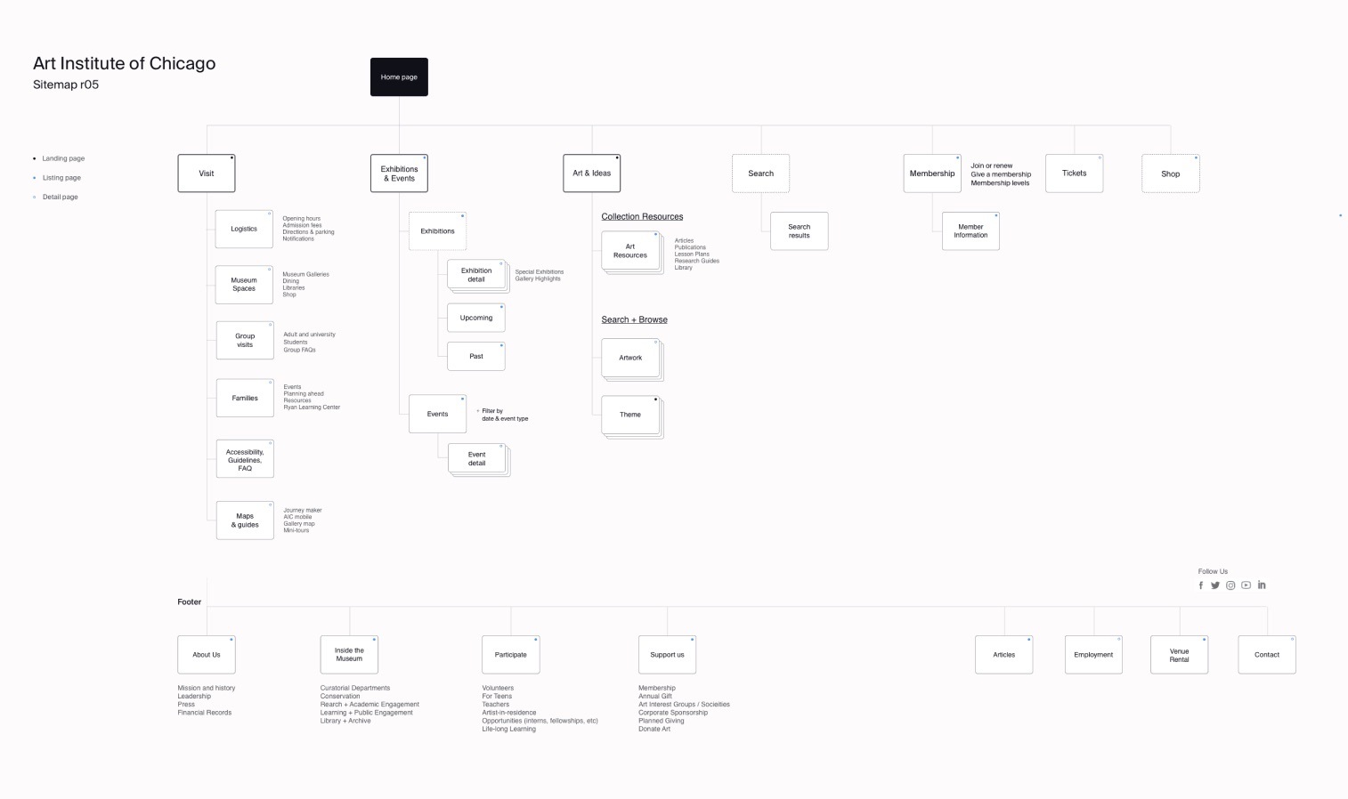
We started the discovery phase with an actual visit to the physical space in Chicago, by observing museum visitors in their context, learning and being inspired by art. We follow-up these sessions with in-depth stakeholders interviews, so we could synthesize models, user journeys and content frameworks.
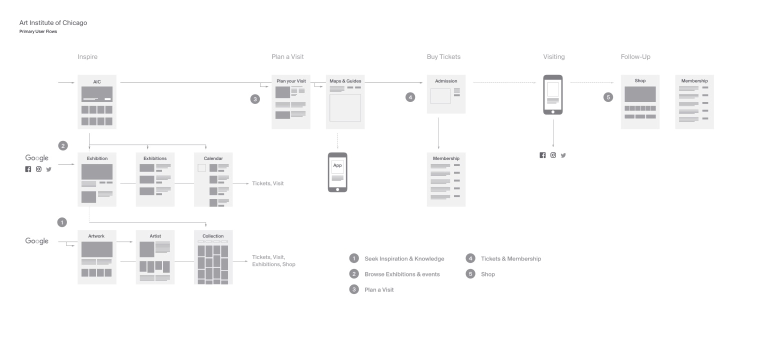

One major challenge was to refine the design proposition and balance general audience needs with a complex set of research content dedicated to advanced users.
We solved this with simpified primary and sub-navigation mechanisms that appear only when necessary, to access in-depth and advanced information.
Interaction design
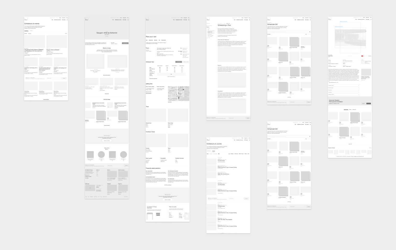
We articulated a design solution by iterating on the UI through low fidelity wireframes and prototypes. From small UI details to an overarching vision of how the different parts fit together.
Prioritizing page content modules and ideating on the different ways the users might interact with the collection to learn new things.
Art Institute of Chicago, Site by AREA 17
- Executive Creative Director
- Kemp Attwood
- Product Director
- Pat McQueen
- UX Design Director
- Christophe da Silva
- Visual Design Director
- Marius Roosendaal
- Tech. Director
- Iain Lawson
- BackEnd Lead
- Fernando Petrelli
- FrontEnd Lead
- Mike Byrne
- Production
- Jesse Golomb