Precision Run started as a treadmill-based group fitness class at Equinox and came to life as a standalone brand with expertly crafted classes, innovative spaces, and on-the-go audio workouts.
A running studio
companion app
- Role
- UX Designer
- Activities
- As the UX Design Director, I was in charge of designing the companion app, an essential part of the whole experience: through Research, Discovery, UX & Product Strategy, Interaction Design.
Audience & business goals
First-Time Runners:
They heard about this new training program in NYC and would like to try it.
Regular Precision Runners:
Going to the studio and launching the app on their iPhone is part of their weekly workout routine.
Business goals:
→ To provide the motivation for prospective runners to attend a first class.
→ To make it easy to get to a PR class.
→ To spark an ongoing connection and to build a community.
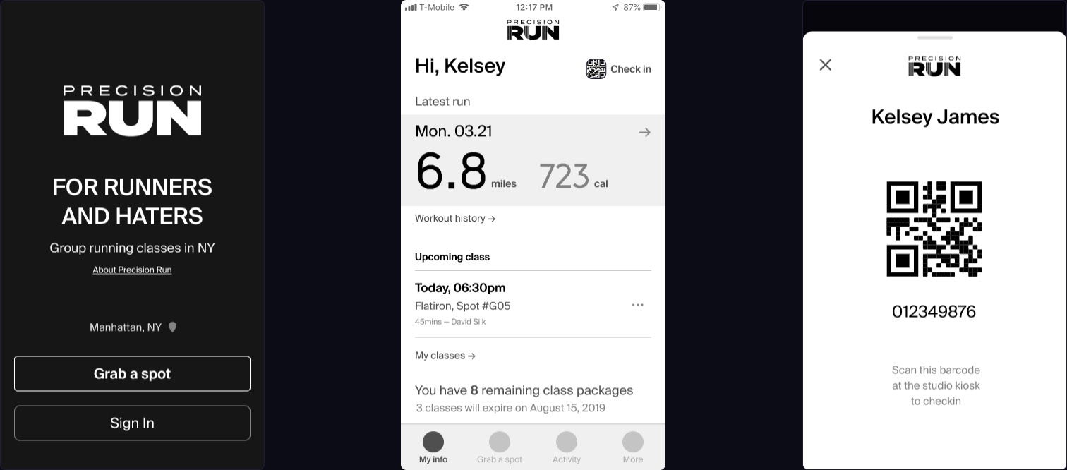
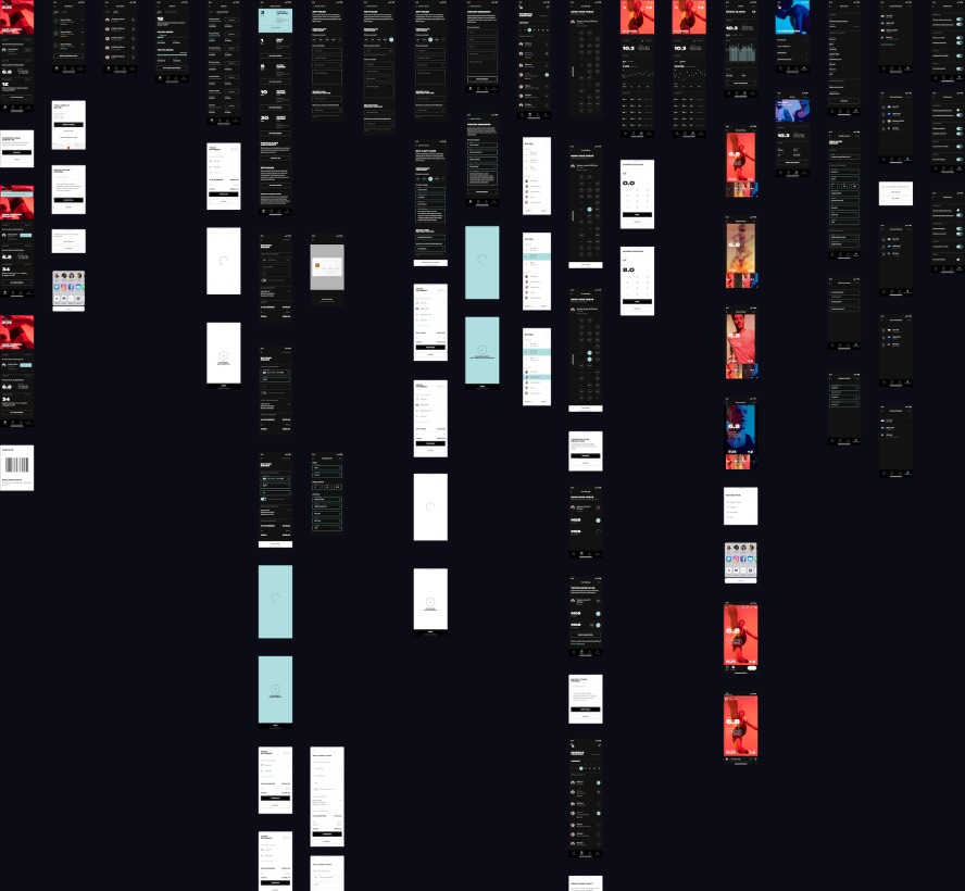
Prototyping wireframes while the brand identity is defined in parallel.
Facilitating studio check-in with an easy to find in-app QRcode and through the Apple Wallet.
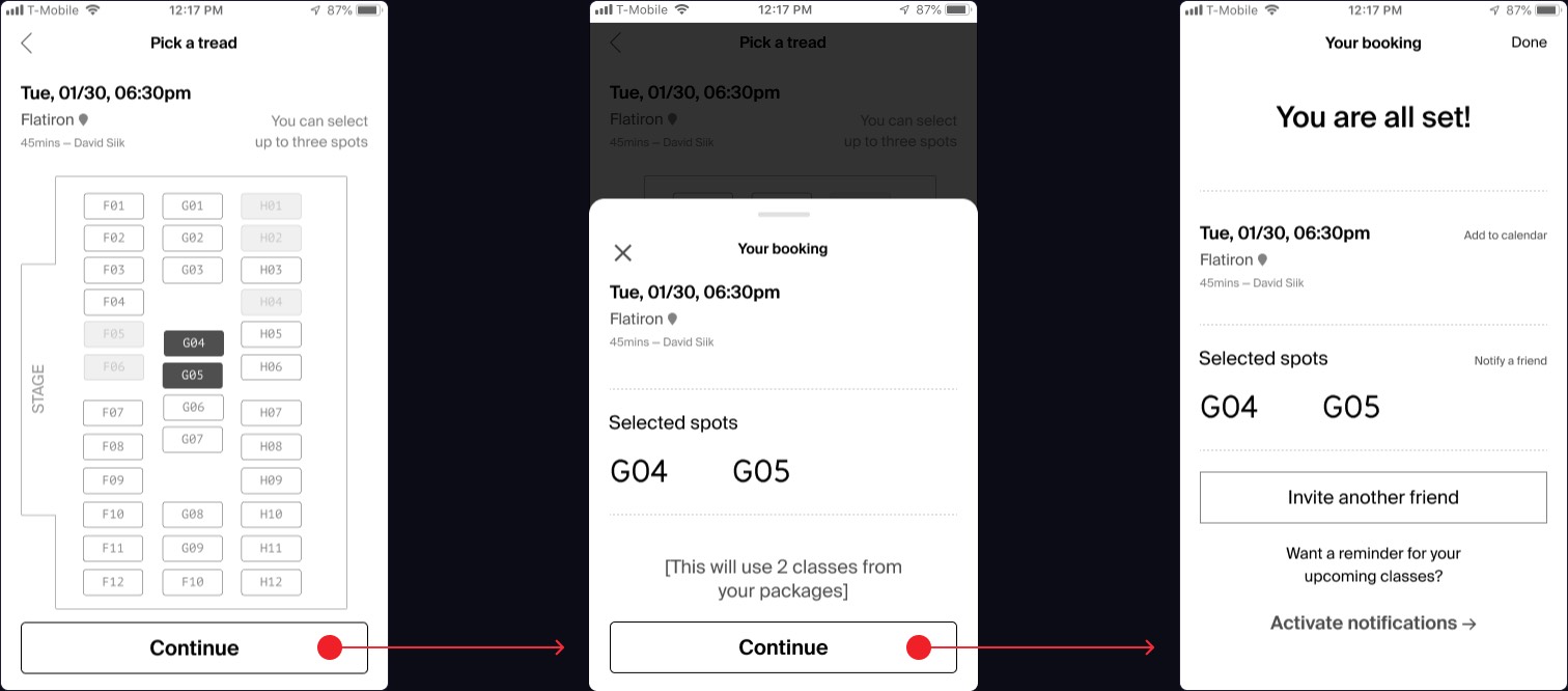
Booking more than one spot: A critical feature both from a user and business perspective.
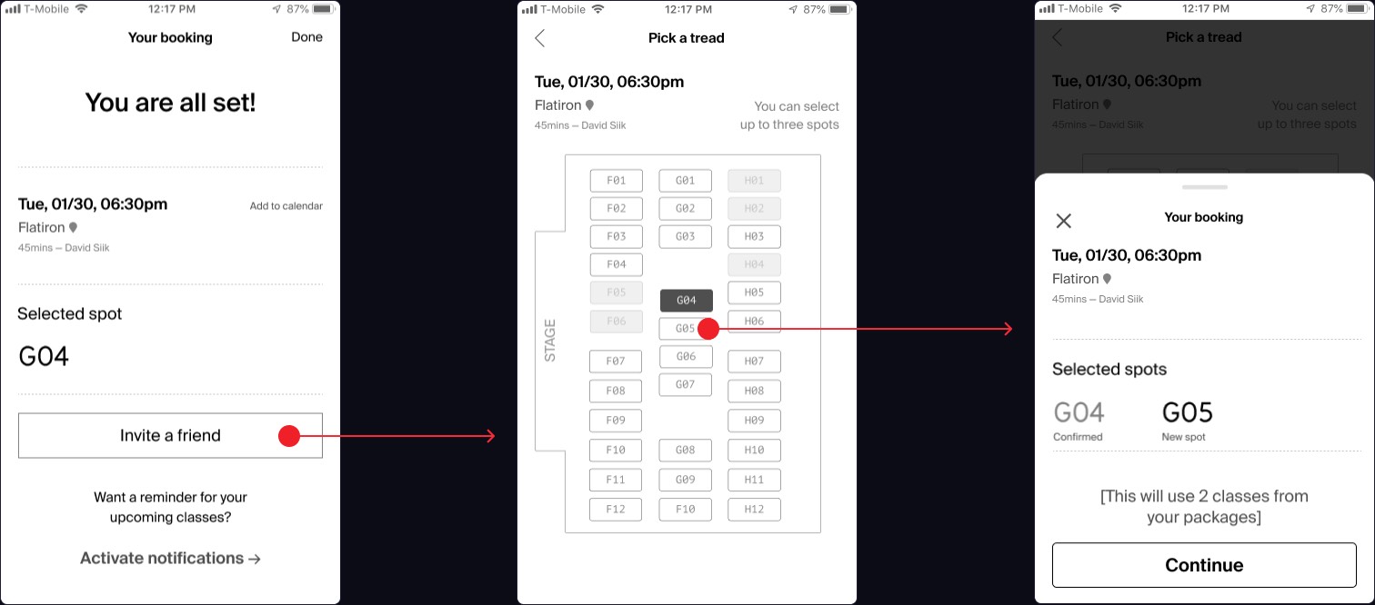
Enabling last minute friend invites by getting directly back in the purchase flow.
Working with visual designers
Reviewing design production and supporting UX/UI enhancements.
Balancing brand identity integration with a seamless user experience. A dark mode by default to fit in the studio experience, and brand color highlights.
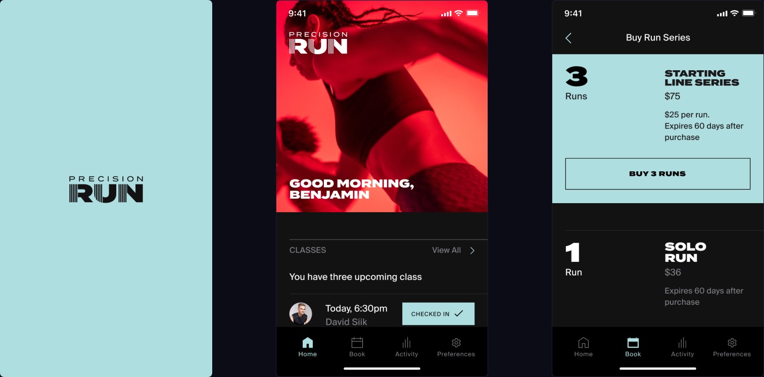 Visual design by Isaac Daniels & Miguel Buckenmeyer
Consolidating booking and transactional flows through confortable touch areas size, labelled fields and streamlined checkout process.
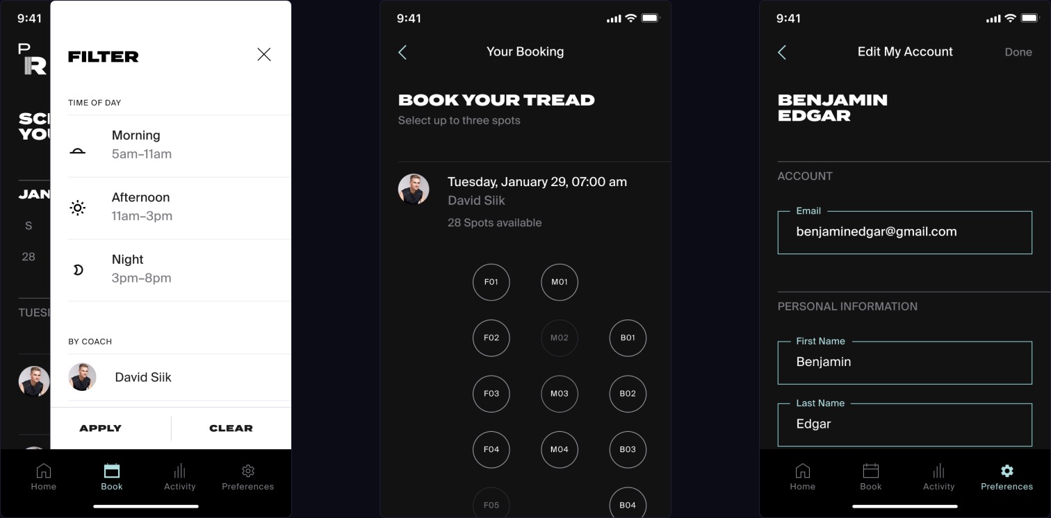 Visual design by Isaac Daniels & Miguel Buckenmeyer
Refined tracking and data visualization segmented by miles and calories, dot and line treatment for graphs.
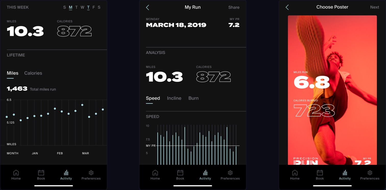 Visual design by Isaac Daniels & Miguel Buckenmeyer
Grand opening
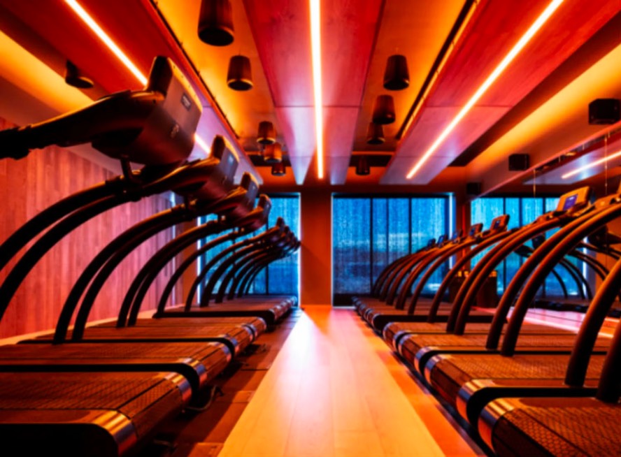
The Precision Run Flatiron studio opened mid May 2019 in Manhattan. The app was released on time and fully functional to be a critical part of the service experience.
Measuring success
- To provide the motivation to prospective runners to attend a first class:
-
• Account creations
• Class bookings
• Purchase runs - To make it easy to get to a Precision Run class:
-
• No drop in booking flow
• Checkin with app
• Low PR contacts
• User satisfaction
- To spark an ongoing connection and to build a community:
-
• App downloads
• Usage frequency
• Social media sharing
• Reviews on app store
• Newsletter & social
Learnings
As usual, web is preferred for discovery, and app installs fit regular usage.
→ The app is a long term foundation, its growth is tightly coupled with the regular customer base of physical studios.
→ Even with a limited audience, early users will expect the app to exist and be highly polished, thus building loyalty and driving recommendations.
Precision Run, an App by AREA 17
- UX Design Director
- Christophe da Silva
- Brand & Visual Design
- Isaac Daniels & Miguel Buckenmeyer
- App Engineer
- Joe Critchley
- Product Director
- Guillermo Brotons
- Producer
- Kelly Murphy