Princeton University Press has a 100 years old book catalog from various expertise fields, our goal was to help users in finding the right book.
Exploring
an influential
book catalog

- Role
- UX Design Director at AREA 17
- Activities
- Research, Discovery, UX Strategy and Interaction Design.
Books as physical objects
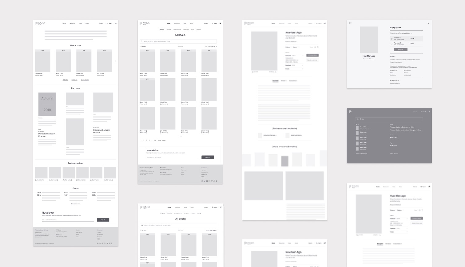
The book can be seen as the central piece, the main object the user can interact with. From the "look inside" feature to the "buying options", everything revolves around the book cover as a main UI element. Bringing a sense of continuity and seamless transitions between the different tasks and screens.
Disciplines expertise
During our ideation phase, we discovered a strong opportunity: to surface the Princeton University Press expertise as a value proposition. Our recommendation was to provide an easily accessible index of disciplines with full fledged landing pages for each of subject.
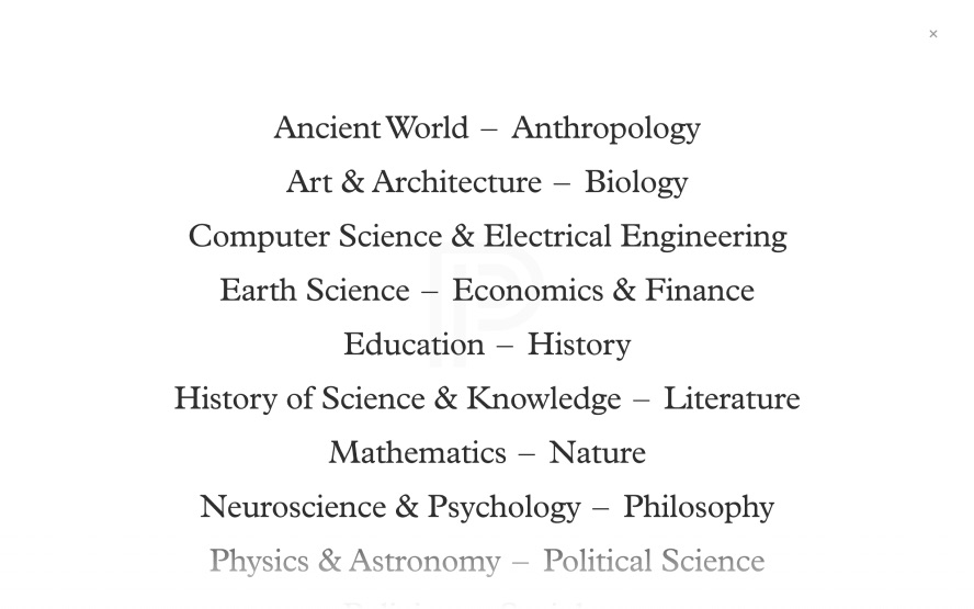
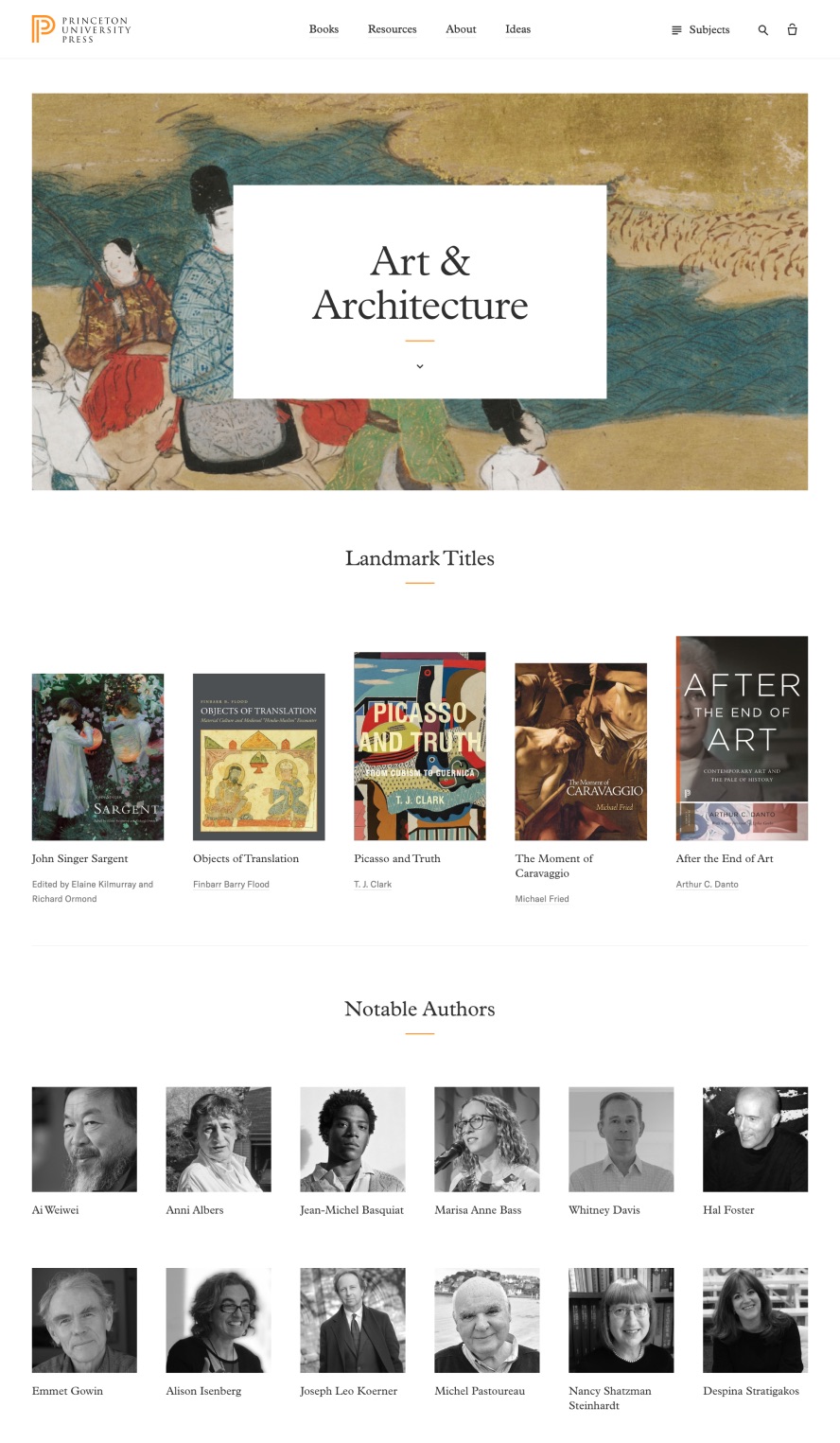 Visual design by Miguel Buckenmeyer
Design process
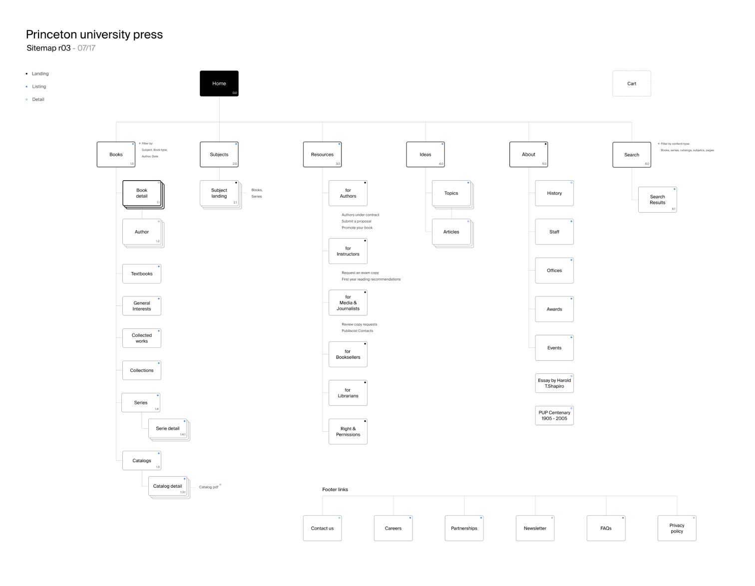
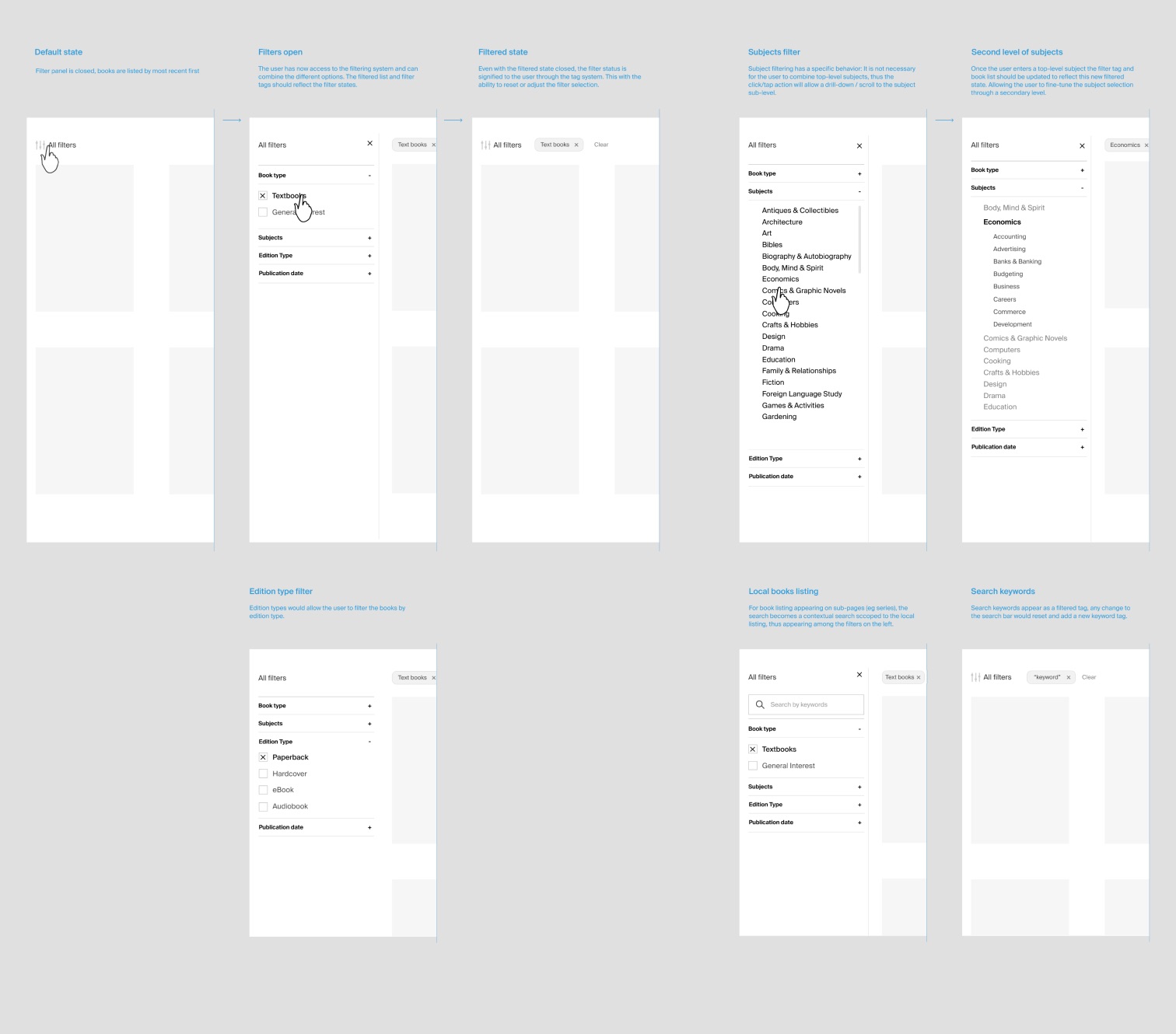
After collecting users and stakeholders research knowledge, we mapped the most critical user flows through an internal design sprint. Surfacing the primary views, high-value features along with the key value propositions of the website.
The next step was to define the different views, content and user tasks to inform how the user interface should work.
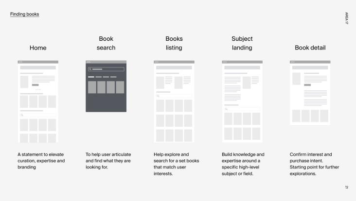
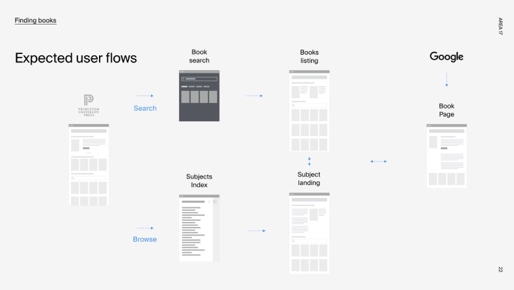
Princeton University Press, Site by AREA 17
- Executive Creative Director
- Kemp Attwood
- Product Director
- Seth Hamlin
- Visual Design Director
- Miguel Buckenmeyer
- UX Design Director
- Christophe da Silva
- Engineering
- Iain Lawson & Antoine Doury
- Production
- Kelly Murphy & Jesse Golomb